Sunday, June 2, 2013

Overlooked and Underrated: The Cougar, Part 2 of 2

Once upon a time, it was a fairly common practice not to reveal a character's origin in his first issue. Nowadays, it's apparently a requirement for comic books to tell the hero's origin story in his first appearance, usually making the origin the main point of the tale. I kind of like it when there's a little mystery. But then again, I enjoy reading the frequently denigrated Atlas/Seaboard line of comics from the 1970s, so what do I know? 

Anyway, picking up from where I left off last time, our overlooked and underrated hero The Cougar lasted a mere two issues before the plug was pulled. As you well know, I quite liked The Cougar #1. I found the title character to be a refreshing change of pace from the usual super hero fare. Can The Cougar #2 measure up? Will it be found wanting? Will it outstrip the excellent first issue? Let's find out!

Cougar versus Wolf!

Beginning, as comic books usually do, with the cover, everything looks to be at least on par with The Cougar #1. Take a gander at that cover! They just don't make dynamic covers like this anymore. The Cougar is fearlessly leaping down to tackle a werewolf who clings to the theater's curtain even as he shreds our hero's back with his claws. Nowadays everything is static: a hero or group of heroes standing around as though posing for a sepia-toned photograph. Yuck.

The Cougar #2 was written by Gary Friedrich, who had done some work at Marvel, and drawn by the illustrious Frank Springer, who also contributed to the first issue. The opening caption establishes that the story takes place in Hollywood in the present day (1975). Our hero Jeff Rand, alias The Cougar, is working on the set of what appears to be an adventure film set in Europe in the Middle Ages. After a performing a stunt in which he dives into a castle's moat, Jeff finds a dead body floating there. Not just dead! The man's "throat--looks like it's been ripped out!" 

 Dammit!

While everyone is flummoxed by the discovery, Jeff thinks to himself that he knows who did it. How? The next three pages are all flashbacks as Jeff reminisces about growing up in the bayou swamps of Louisiana. While he enjoyed his childhood poverty and swung about on vines playing Tarzan, he also learned from the wisdom of Black Hattie, "the area's resident witch." Jeff's older brother Rick, for no explained reason, developed a hatred for her. So naturally Black Hattie put a curse on Rick. 

 That's never good.

Two years later, Jeff comes home from a day of fishing and playing Tarzan and finds a half-man, half-wolf has ripped out his parents' throats "exactly like the man on set today." Jeff grapples with the werewolf, but is knocked unconscious. 

It occurs to Jeff that he hasn't seen Rick since that fateful day. "What if--dare I even think it?!" says his thought bubble. Jeff calls his cousin Roger to learn more about their family. As we know from last issue, being named Roger is not a good thing in The Cougar. Sure enough, after Roger hangs up the telephone, the werewolf enters through a window and rips out his throat. Jeff turns up shortly thereafter and calls the police to report his "startling shocking discovery." At the scene of the murder, Jeff and a police detective named Marcus realize someone (or something!) is eavesdropping at the bedroom window, but the werewolf scampers off upon being discovered.

 Couldn't you at least try regular bullets?

The comic book shows us the back of a man who apparently has tried to bind himself with ropes, but to no avail: "No matter how I try to restrain myself--to hold back the nightmare--I cannot!" Interestingly, the man also thinks, "I don't hate Jeff--or anyone else!" I have to admit, there's really no mystery as to the identity of the werewolf, is there? 

 Maybe try chains?

Just in case you're not certain, I'll hold off on the revelation until the comic book tells us for sure.

We cut to Jeff sitting up in bed at his apartment, where again he is reminiscing, this time about how he became The Cougar. After working in Hollywood as a stuntman for two years, Jeff was cast as the lead in a movie about a super hero called The Cougar, but the film bombed at the box office. Jeff went back to work as a stuntman and kept wearing "the corny costume left over from [his] disastrous attempt at stardom." Not much of an origin if you ask me, not to mention it contradicts the statement in The Cougar #1 that he earned his nom de guerre "due to his cat-like speed and agility" rather than any movie role, but then again he's not really a super hero so much as a guy who finds himself in weird situations and does what he can to best the supernatural menaces he faces.

Later that day, Jeff accompanies his girlfriend Janie Johnson to her gig at the L.A. Forum, which is of course where the werewolf next strikes. As The Cougar and Marcus watch Janie's performance from the wings, the werewolf assaults anyone in his way and takes to the stage, where he promptly uses Janie as a human shield against the threat of Marcus's gun. 

 Not sure why he needs a hostage!

The Cougar climbs a rope to the catwalk above the stage and taunts the werewolf. Marcus shoots the werewolf, but naturally bullets not made of silver have no effect. The werewolf rushes Marcus, but The Cougar swings down and knifes the beast before slamming into a large amplifier. I guess the knife was made of silver, as it kills the werewolf, whose dying form reverts to that of Rick Rand, Jeff's older brother. 

 Surprise, surprise!

Sadly, Jeff's act of heroism also shattered his spinal cord. He undergoes surgery, but the doctor tells Janie and Marcus that Jeff will be permanently paralyzed. 

 "Noooo!"

Quite a thing to happen to our hero in only his second outing! The "Next Issue" box at the end of the comic book reads: "A crippled Cougar--helpless in a jungle of evil?!" I read somewhere that in the next issue The Cougar was to get involved somehow in the plight of disabled veterans. Can't remember where I read that, though--maybe in Comic Book Artist #16? Unfortunately we will never know what happened to Jeff Rand, as there was no third issue of The Cougar. The title was canceled even as Atlas-Seaboard imploded upon itself, taking a fine line of comics with it.

Issue #2 doesn't succeed as a mystery, as I don't think anyone failed to guess who the werewolf would turn out to be, but it's a ripping action-adventure yarn and introduces some elements that probably would have been really good if the series had continued. Would Jeff Rand somehow recover from being paralyzed? Will The Cougar work with Marcus to help the police with supernatural cases? Can Janie and Jeff sustain a relationship while dealing with the stress of his paralysis, her burgeoning singing career, and his public heroics, not to mention his work as a stuntman?


Overlooked and Underrated: The Cougar, Part 1 of 2

In my opinion, the Atlas/Seaboard line of comics from the mid-'70s is unfairly maligned and, consequentially, overlooked. I believe many who belittle and disparage Atlas/Seaboard comics are merely repeating what they have heard or read elsewhere and have not actually read the comic books themselves. The reason I believe this is that I often hear the claim that Atlas/Seaboard was "aping Marvel" and that the characters were "Marvel knockoffs." While it may be true Martin Goodman determined that Atlas/Seaboard comics needed to look and read more like Marvel comics, that directive apparently came only after the first couple of issues of most series were already published. Initially, the Atlas/Seaboard line had a wholly different feel than concurrent Marvel or D.C. comics. They were grittier and more grounded in reality, for one thing, what with characters having very limited powers and many of them being more antihero than hero. The Brute killed a young boy in his first issue! The Destructor was only a hero because he wanted vengeance against the mob he used to work for! But today we will discuss...The Cougar!

No, not that cougar--although she is overlooked and underrated as well (I will never understand how Jennifer Aniston can be more popular than Courteney Cox).

 
This Cougar! 

The Cougar #1 was written by Steve Mitchell, who I don't know from Adam, and drawn by Dan Adkins and Frank Springer, two of the most talented artists ever to work in comics. The cover is fantastic. Just check out the acrobatic leap The Cougar is making in his effort to save the blonde damsel in distress from the clutches of a vampire! He puts Daredevil to shame! I want to read this comic based solely on the captivating cover! You don't see a lot of that anymore. The cover copy includes this caption: "A Hollywood Stuntman Turned Night Stalker!"

My understanding is that Atlas/Seaboard originally wanted to license the television series "Kolchak: The Night Stalker" for its comics line but the publisher was too frugal or felt the TV show wasn't successful enough. However, the only thing I really found similar between The Cougar and Carl Kolchak is that both get involved in supernatural occurrences. There's not much else I could put my finger on, although I've hardly seen any episodes of the TV show so maybe a more educated reader can inform me if there is anything more to it.  In any case, issue #1 is dedicated to Dan Curtis, the television show's producer, which is kind of a classy move in my book since they could just as easily have ripped off the concept without acknowledging it at all.

The story opens with our hero, stuntman Jeff Rand, working on the set of a horror movie. It's not stated, but apparently they are filming on location in a village in Eastern Europe, maybe even Transylvania. As the comic book tells us, Jeff "is known to his fellow stuntmen as The Cougar, due to his cat-like speed and agility." After the day's shooting is done, a fellow employee named Roger goes to check out the castle at which they will be filming the next day. While at the castle, Roger finds what he believes to be a prop stake stuck in a cloak in a coffin. You can surely see where this is going, right? 

Good move, Rog!

Ol' Rog removes the stake from the coffin, of course, and immediately afterwards pays the price when a vampire suddenly appears. The comic book cuts away before we see exactly what happens to Roger, but you can be sure it's nothing pleasant.

The vampire then takes to the village streets "to quench his ages-old thirst for blood." He comes upon a tavern where Jeff (in a super hero costume for no apparent reason) is knocking 'em back with Harve, a fellow stuntman, and an unnamed blonde makeup artist. The vampire believes the makeup artist to be "Katya...my love!" The vampire assaults Jeff and attempts to abduct "Katya," resulting in a brawl.

Just like this.

Poor Harve is such a wimp, the vampire knocks the fight out of him faster than you can say Jack Robinson. A policeman turns up and shoots the vampire five times, achieving nothing except the vampire apparently panics and flees. No one tries to stop him. A caption reveals that the blonde makeup artist is called Kathie...any connection with Katya?

The next day Roger, of course, doesn't show up for work and his whereabouts are unknown. Jeff determines to check the castle where Roger was last known to have gone. Roger's body is found there...drained of blood! 

 So much for Rog.

Jeff goes to an old bookstore to see if he can learn more about the castle outside of town because "it's owner was supposed to be a vampire!" With the assistance of an elderly clerk, Jeff learns that the castle was built by Baron Krolok in the 1600s, who "went off to fight the Turks and when he returned, he did so as one of the undead!" The villagers used "one of his blood-lovers...a girl named Katya" as part of a trap to destroy Baron Krolok. Jeff pieces it all together and arranges police protection for Kathie because she "must look enough like [Katya] for Krolok to think [Kathie] is [Katya]!" The vampire soon turns up at Kathie's door, where he makes short work of the policemen who stand in his way. He kicks in the door and knocks out The Cougar, then abducts Kathie.

 Baron Krolok doesn't mess around!

Twenty minutes later, The Cougar regains consciousness, commandeers an old car, and races to Baron Krolok's castle. He proceeds to get the crap beaten out of him for a two full pages.

 Vampires are tough!

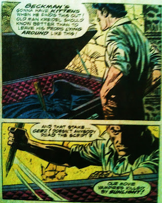
Soon, though, he finally wises up and breaks a wooden table to make a stake, which he then uses to impale the vampire, thereby ending the undead menace. The end.

 You had it coming, Krolok!

I like that The Cougar has no super powers and doesn't even come off as especially bright. Nor does he have a bone to pick with criminals. He's just a really good stuntman and a guy who wants to help his friends. There's no over-the-top emoting as you would find in Marvel if, say, a friend of Peter Parker's was found dead. Unlike Peter would probably do, Jeff feels no senseless guilt over failing to prevent something he wasn't involved in. There's none of this "I'll handle it on my own!" nonsense either; Jeff's first move is to contact the police! It's refreshing. There's nothing especially Marvelesque about it, either, except perhaps the use of the banner across the front cover. And I only wish D.C. had been producing comics as good as this at the time!

Stay tuned for my review of The Cougar #2!

Sunday, May 19, 2013

Review of Archie Comics' New Crusaders

I'm late to the game. I first heard about Archie Comics plans to revive its super hero line sometime last year, but somehow lost track of it. Then I read somewhere that the comics were going to be digital first, then printed later. Well, I don't read digital comics simply because it means I need to wear my glasses and I hate wearing my glasses any more than I already have to. Also, I prefer to read my comics while reclined on the sofa or bed, and I don't want the burden of holding my laptop computer or staring at teeny-tiny images on my telephone. Anyway, Archie put out six issues of "New Crusaders," which they recently collected in a paperback. 


I had some trepidation about purchasing the paperback collection of "New Crusaders." I'm a longtime fan of the Archie super heroes. I have a lot of the '40s comics on some presumably bootleg discs. I've got a couple dozen of the '50s and '60s comics featuring the Fly, the Jaguar, Black Hood, The Comet, and the rest of the gang. Some deride the mid-'60s Mighty Crusaders as campy and claim it was an attempt to cash in on the 1966 Batman television series. Well, I just found the comics to be a fun exaggeration of what Stan Lee was doing over at Marvel. Are you telling me Spider-Man, Thor, and Captain America aren't campy? Read those comics again and face front, true believer. Marvel's mid-'60s comics were extremely campy. The Mighty Crusaders just made it over the top for the sake of humor. These comics were written on two levels: the kids could dig the colorful super heroes having their exciting adventures, while the adults could laugh at the goofy situations. As for the Batman connection, that's utter nonsense as the television show came out after the Mighty Crusaders.

I have maybe a third of the '80s revival issues, most of which were pretty good, as well as an issue or two of the '90s version printed under the name Impact Comics. Those that I've read were good enough that I'd like to read more of them. I don't have any of D.C.'s recent grim-and-gritty licensed versions. They just looked awful and seemed the antithesis of everything the name Archie brings to mind. But you can't judge a book by its cover: I flipped through some of them in the bargain bins and saw that they were, if anything, even worse than they looked. 

So I feared that perhaps Archie Comics was jumping on the disgusting hyper-violent, ultra-sexualized bandwagon in an attempt to move in on Marvel and D.C.'s market share. I thought maybe Archie Comics, a class act as far as wholesomeness goes, would transform my beloved heroes into "grim and gritty" vigilantes in the vein of the modern take on Batman as a perpetual a-hole, Daredevil as the man without anything worth living for (although I hear good things about Mark Waid's new series discarding 30 years of "Miller lite," and the artwork looks very nice from what I have seen), Wonder Woman as a murderess, Wolverine as the model on which all characters' heroism should be based, and so on. I was afraid because I love those Archie heroes. As much as I would love to see the return of my beloved Jaguar, Fly, Fly-Girl, Web, Black Hood, Comet, and the others, I'd rather have them in mothballs than see another bastardized version. After all, I can always read my old comics and keep on the lookout for affordable back issues (side note: Archie Comics, please please PLEASE put out some kind of Archives- or Masterworks-style volumes of your super hero comics!).

Anyway, I bit the bullet and I bought, via Amazon (love those discounts), the first collection covering issues 1 through 6, and just finished reading it yesterday. On the whole, it's pretty good and I've already pre-ordered (again, via Amazon) the next collection. There may be some spoilers ahead, so if you think you may be reading these stories, you might want to skip the rest of this, but even with what I reveal I don't think it will detract from your enjoyment if your tastes are anything like mine.

What I liked: the heroes are heroic and just generally good people. Marvel and D.C., take note. Super heroes don't have to scowl and grimace and act like a-holes to each other 24/7 to show how "cool" and "edgy" they are. I liked that Archie's colorist is using some bright colors. Most other comics I have seen of late seem to think the world is shades of brown and grey and just generally look dingy and greasy. Again, Marvel and D.C., please look out your apparently filthy windows and you'll see the world is not as dark and dreary as you like to depict it. Step outside. The sky is blue. Grass is green. Some people even dress in primary colors!

I liked that so far the fate of the Mighty Crusaders is a question mark and I hope Archie Comics will refrain from graphically destroying beloved characters. Better to leave them presumed dead than to show them with holes in their heads. That way you can bring them back anytime you like without a convoluted or insulting explanation.

I liked that the New Crusaders' reactions to events around them were a lot more rational and believable than you usually see in comic books. They actually seemed like teenagers. I'm enjoying the way the series is going light on the angst so far. I also like the artwork for the most part. I appreciate that not everyone has the same body type, the males aren't all musclebound, and the females aren't all "enhanced" and dressed like strippers. 

The new costumes are pretty good, much better than most of the ones used by Impact in the '90s. The exception is the Jaguar and her hideous helmet and exposed abdomen.It's not clear why she isn't using the original Jaguar's belt since it was shown to be readily available. The art veers a little into the animated D.C. style, and sometimes into the Japanese cartoon style, but not too much or it would've killed it for me. I can't stand the D.C. animation style where all the men have steroid-induced upper bodies and little chicken legs, and all the women are built like teenage girls. Japanese cartoons leave me cold with the stick-up hair of strange colors and the big eyes and tiny mouths. (Yes, I know that's not true of all Japanese cartoons. Some are quite good.) The artist uses nice, crisp, clean lines and draws faces well enough that I can tell who is who, which is more than I can say for a lot of comic book artists employed by Marvel and D.C.

Finally, I enjoyed the tips of the hat to MLJ, Zip, Impact, and other names from Archie Comics' long history. My understanding is that the Fly, my favorite Archie super hero, can't be used as the estate of the great Joe Simon somehow has the rights. I may be wrong on that, but that would explain why the Fly is only mentioned in vague terms and never by name.

Things I didn't like: I didn't care for all the unnecessary blood and graphically present killing by Brain Emperor and his minions in issues 5 and 6. Some of the violence was implied rather than shown, but enough was depicted that I can't share your comics with my young son who is just starting to develop interest in comic books. I was really hoping for a series I could let him look at (he can't read yet). All I have right now (as far as new comics go) is some collections of Incredibles comic books that he can peruse without me having to worry. I didn't like Brain Emperor's new look. It just seems so '90s "grim and gritty" that it looks cheesy to me, like something I would draw if I were mocking those times. Since that's clearly not the intention, Brain Emperor's new look doesn't work for me.

Additionally, I found the Fireball/Fly-Girl relationship far too obvious. It was telegraphed from the very start and it was just too cliched for my taste. Speaking of cliched, the flame-powered hero being an impulsive hothead has been done, what, a hundred times already? Makes me want to write a story with a flame-powered hero who thinks before he acts and is calm and collected under most circumstances.

I wasn't crazy about the cliched super-team start-up idea of the older hero training the greenhorns or their cliched super-base of operations. Seen both too many times before, but it's at least those are relatively inoffensive cliches. The writing is good enough that a character who dies at the end comes as a surprise and I actually cared despite having only known the new Fireball for 6 issues and there really wasn't much revealed about the character. The kids' reactions to his death seemed very real and not over the top. It was effective and affecting.

The story so far has me wondering where it's all going, what happened to Mr. Justice, how Brain Emperor came back, and more. In many ways, this new series feels a lot like how comics felt back in the "good old days." I've enjoyed what I've seen so far and hope it lasts for a long time to come.

Thursday, May 9, 2013

R.I.P. Ray Harryhausen (June 29, 1920 to May 7, 2013)

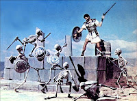
I don't play a whole lot of Dungeons & Dragons for three reasons. First, I seldom can find a game that works with my schedule. Second, there are other fantasy role-playing games I think are much better. But the primary reason is that most D&D games seem to be set in knockoff Tolkien worlds full of enigmatic elves, subterranean dwarves, and furry-footed hobbit ripoffs. I'm not a huge fan of that setting. Not because I dislike Tolkien; I enjoyed The Lord of the Rings (although I find The Hobbit unreadable). It's because I was much earlier in my life drawn into a more exciting, more fantastic setting: the world of Ray Harryhausen's Sinbad movies, as well as (to a lesser extent) Jason and the Argonauts and other films he worked on. In particular, I'm a big fan of The Golden Voyage of Sinbad and Sinbad and the Eye of the Tiger. That's the setting I want to adventure in! A fantasy version of Arabia and the Mediterranean, full of evil wizards and enchantresses, rocs and cyclopes and golems, sword-wielding skeletons, sea voyages, and comely maidens portrayed by the likes of Caroline Munro and Jane Seymour! What's not to love?


How could anyone look upon these images from various Harryhausen films and not be inspired to play a fantasy role-playing game set in the world depicted therein? Now, who wants to roll up some characters and venture forth to rescue the wizened caliph's beautiful daughter who was abducted by a roc on orders from a wicked sorcerer?


Super Hero Role-Playing Games

I enjoy all sorts of role-playing games, but by far my favorite type is super hero role-playing. I have more super hero role-playing games than I can shake a stick at, including newer ones such as Marvel Heroic Roleplay and DC Adventures, but the ones I keep coming back to are the earlier models that managed to include a complete gaming system in a slim box and not too many pages. I just can't get into the sesquipedalian games produced nowadays. They take forever to get to the point, and try to jam in rules to cover every eventuality no matter how unlikely. The 6th Edition of Hero System is probably the extreme example of this trend. Call me old-fashioned, but I want to read a game's rules in one sitting and be able to understand the basics and then get right into playing.

I call my favorite old-school super hero role-playing games the Big Five: Villains and Vigilantes, Champions, Superworld, Marvel Super Heroes, and DC Heroes (in order of publication). There are older super hero role-playing games, but none appear to have been especially playable or well-distributed. Anyway, here are the Big Five and what I perceive to be their particular merits and drawbacks.

Villains and Vigilantes, 2nd Edition (1982)

Villains and Vigilantes allows one to roll up a character in mere minutes. The rules are explained in an incredibly straightforward way and are, for the most part, simple. There is a little math involved in figuring out how much your hero can lift and a few secondary characteristics, but these are calculations you make before the game ever starts and you don't have to worry about them afterwards. The main problems I have with the game are: (1) the complete and utter lack of any rules for obtaining or using skills, and (2) the bizarrely low odds of connecting in hand-to-hand combat. It's really impossible to create a hero along the lines of Batman with the rules as presented. However, Villains and Vigilantes is easy to add to if one so desires. 

Some take issue with two core concepts of character creation in Villains and Vigilantes. First, many balk at the idea that you play yourself as a super hero. Second, powers are generated randomly and many dislike that and prefer to design their ideal hero. I've always found these objections fairly silly as all one needs to do is ignore the "play yourself" aspect and then either roll up or model a character with the game master's consent. Open-ended powers such as "Body Power" and "Mutant Power" allow you to create any super power you want to (with your game master's consent) without much effort. 

A final note on Villains and Vigilantes: the art by Jeff Dee is quite fun, quirky but high quality.

 Champions, 2nd Edition (1982)

Champions is, in many ways, the opposite of Villains and Vigilantes. Players get a fixed number of "character points" with which they buy their hero's attributes and powers. Costs of powers can be modified upwards or downwards by taking advantages and limitations of the player's choice. Unfortunately, an unintended consequence of this is that players are encouraged to become rules lawyers in order to pay fewer points for greater power. Fans of the game will tell you that you can create any power you want, but they don't mention that a lot of times it requires very convoluted combinations of advantages and limitations and annoying math. Additionally, the game uses only six-sided dice, and you wind up having to roll large numbers of dice to resolve combat. Champions tends to get bogged down once fighting starts.

There are later editions of Champions, but in my opinion the problems with the system have only been exacerbated with each new edition after the 4th, which struck a nice balance.

The art in Champions is only so-so. It's a step above rank amateur, but well below the standard of a mediocre comic book from its era.

Superworld (1983)

I have never had the opportunity to play Superworld. The rules presentation is wonderfully clear, and the game uses an example of character creation to guide you through essential concepts. It all comes across quite well and is easy to understand except nowhere could I find any sort of "strength chart," i.e., something that explains how much my character can lift based on his Strength attribute. Hopefully someone reading this can explain that part to me. I was trying to model a character but gave up as a result of this apparent omission. Aside from that failing, this looks like a game I could love.

The art in Superworld is what I would call amateurish. Nothing is awful, but nothing is very good either.

 Marvel Super Heroes (1984)

Marvel Super Heroes lets Spider-Man and some of his amazing friends  explain the rules to the reader in a very clear and entertaining manner. Combat and resolution of other tasks is extremely simple, relying on one chart that can be found on the back of each booklet in the game. There are two methods presented for character creation: (1) the player describes his hero to the game master, who then assigns powers and skills, or (2) random rolls in the vein of Villains and Vigilantes, albeit with a much more rudimentary list of powers and skills.

Based on the lack of a comprehensive list of powers and skills, it does appear that the designers intend for you to play a character from Marvel Comics. However, it's really quite simple to add any power or skill you want to the game. You just describe what it does and give it a name. If I were going to try to start a new game with players who don't know any of these systems, this would be the simplest one to use.

The talent of the Marvel Bullpen ensured that the art found in this game is of the highest caliber.

DC Heroes, 1st Edition (1985)

Last but not least, DC Heroes has by far the most elegant system of all these games. To resolve an action, you roll once and compare your results to two charts. That's it. The math is incredibly simple and the only time you might want to break out your calculator is during character creation. You use character points to design your ideal hero in a fashion similar to, but far more streamlined than, Champions. It's also the only game that seems to have taken into consideration the idea that a player might want to create a hero who has no super powers but relies only on his skills or gadgets or some combination thereof. The only real glitches in the game are (1) the relative costs of the various powers and skills, a problem they fixed with the 2nd Edition a few years later, and (2) the lack of any special advantages or drawbacks to customize two characters who otherwise have similar power or skill sets, which was also fixed in the 2nd Edition. If I were going to play DC Heroes, I would definitely use the 2nd Edition.

The art throughout DC Heroes is lifted straight from comics books or else drawn by DC's top tier of talent. It's downright beautiful, though lacking some of the folksy charm of the Marvel Super Heroes game.

Each of these games has its own quirks and flavor, and I could easily be persuaded to play any or all of them. I like Villains and Vigilantes because of its quirkiness as well as the fact that I get a complete and playable game in under 48 pages with no need for any supplements. I like Champions because I can design any character I want, though I would just disregard the "character point" nonsense and build my ideal hero without worrying about the math. I like Superworld because of its presentation style and simplicity, although I still haven't figured out what a particular number really means when it comes to my hero's Strength attribute. I like Marvel Super Heroes because it's incredibly easy to jump right in and get playing, and also to customize powers without worrying about "character points." Finally, I like the elegance of DC Heroes' underlying system, but again I think I would disregard "character points" and just design a hero based on my tastes instead.

If I had to rank them based on how easy they are to learn and play:

(1) Marvel Super Heroes
(2) DC Heroes
(3) Villains and Vigilantes
(4) Superworld
(5) Champions

If I had to rank them based on how good the art is:

(1) DC Heroes
(2) Marvel Super Heroes
(3) Villains and Vigilantes
(4) Champions
(5) Superworld

If I had to rank them based on how elegant the actual game system is, regardless of how easy it is to learn:

(1) DC Heroes
(2) Marvel Super Heroes
(3) Superworld
(4) Villains and Vigilantes
(5) Champions

Finally, if I had to rank them based on which I'd like to play:

(1) Villains and Vigilantes
(2) Superworld
(3) DC Heroes
(4) Marvel Super Heroes
(5) Champions
 
In case anyone is interested in these games, be forewarned that Superworld, Marvel Super Heroes, and DC Heroes are out of print and hard to find at a decent price. Champions exists as part of the Hero System, but is around a thousand pages long nowadays and written by a lawyer whose goal appears to be to cover every possible situation, no matter how unlikely, making the rules largely unreadable. Villains and Vigilantes is still available from its original publisher, Fantasy Games Unlimited, through their web site.

By the way, if you're curious, yes, those are photos of my actual game boxes, not just images I found online!

Thursday, April 4, 2013

R.I.P. Carmine Infantino (May 24, 1925 to April 4, 2013)

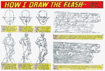
Who's to say whether the Silver Age of comic book super heroes would have taken off as it did if not for the contributions of Carmine Infantino? He designed the second (and best) Flash's unforgettably streamlined Jet Age costume and drew his adventures from 1956 to 1967, then returned to draw the Flash's final tales from 1981 to 1985. He was the artist on The Flash when I began reading super hero comics as a kid. The Flash was my favorite super hero even when his comic book became bogged down in an interminable and legally erroneous (as it was self-defense under the law) storyline about our hero's manslaughter trial, and even after The Flash was canceled to clear the decks for D.C.'s ill-conceived Crisis on Infinite Earths. The Flash is still my favorite D.C. super hero, and when I picture the Flash, I picture a drawing by Mr. Infantino. He was the perfect artist for the fastest man alive.


No one conveyed speed quite like Mr. Infantino! Let us not forget that he also helped create the "New Look" Batman with the yellow oval on his chest. Quite a change from Bob Kane's various ghost artists. Mr. Infantino brought Batman into the modern era.


Not to mention he co-created Batgirl, everyone's favorite "dominoed dare-doll."


But for that, we never would have had Yvonne Craig looking like this. Hubba hubba!


According to the infallible Wikipedia, Mr. Infantino was cited in a Comics Buyer's Guide poll as the greatest penciller of all time. I'm sure some would argue about that, in fact I know some would. By strange coincidence, I was visiting another blog today and defending Mr. Infantino's late-period artwork in the pages of The Flash, Spider-Woman, and the "Dial H for Hero" feature in Adventure Comics. While his art had become highly stylized in his later work, I would argue it was at least as great as his work in the '50s and '60s. I certainly enjoyed it and wish I could draw like that.


Perhaps his stylistic changes are an acquired taste that requires more work on the part of the reader to be appreciated than the more conventional art done by the photorealistic/commercial artists that seem to have come into vogue in the comic book world. Mr. Infantino was a master of laying out panels so as to guide the reader's eye through the page. He also designed many of the greatest comic book covers of all time. Just Google for yourself!


Goodbye, Mr. Infantino.

Super Heroes and Comic Book Cover Art

Some super heroes standing around as though they were posing for a photograph. 


Super-types seem to do a lot of that, especially on the covers of their comic books nowadays. Used to be they would be in action on the cover, presumably the publisher's way of catching your eye and drawing you in. Now that they've given up on attracting the casual reader, the covers are basically just tiny posters. Usually poorly drawn, too. Compare for yourself.


This cover makes me want to know who the Queen Bee is, how she managed to make these powerful super heroes her slaves, why she's doing it, and how the Justice League will prevail.


These girls just seem to be confused as to why they're there. They certainly aren't interacting with each other or anything else. I won't even bother noting the bad perspective and incorrect anatomy. Whoever drew this needs to actually look at some women before making another attempt at drawing them.